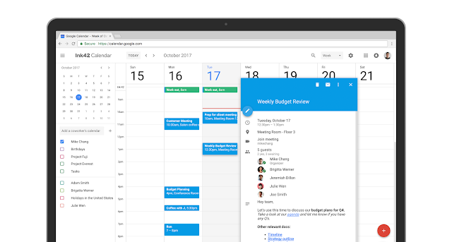
Check your schedule. Starting today, a fresh look and new features are coming to Google Calendar on the web to help you manage your time more efficiently and get more done.
We’re taking a lot of what you know and love from Calendar’s mobile application, like the modern color palette and sleek design, and bringing it to the web with a responsive layout that auto-adjusts to your screen size. We’ve also added more features for enterprises to help teams schedule and prepare for meetings.
Over the years, you’ve shared valuable feedback on how we can enhance Calendar to better fit your needs and we’re excited to bring new improvements. Now, it’s even easier to manage your schedule at your desk. In the new Calendar for web, you can:
- Add rich formatting and hyperlinks to your Calendar invites. Link to relevant spreadsheets, documents or presentations in your Calendar invite and open them directly from the new “Event Detail” view. This can help you create more detailed agendas and ensure all materials are in one place before your meeting starts.
- Manage multiple calendars side by side in “Day” view. Now you can view and manage calendars in separate columns. This makes it easier for employees who manage multiple calendars, like administrative assistants, to schedule meetings on behalf of their teams. Click “Day” view and select the calendars you want to compare.
partially reposted from https://gsuiteupdates.googleblog.com/2017/10/new-calendar-user-interface17.html


